Project Statement
Wisconsin Asian American Voices for Empowerment (WAAVE) is a nonprofit organization dedicated to empowering Asian American communities throughout Wisconsin through education, advocacy, and grassroots organizing. By fostering civic engagement, strengthening community connections, and mobilizing collective action, WAAVE helps Asian Americans advocate for their rights through meaningful policy change.
The goal of this project was to develop a visual identity that authentically reflects WAAVE's mission and values. The brand should have a welcoming and recognizable presence for diverse AAPI communities across Wisconsin.
Research & Moodboard
To establish a strategic foundation for the identity, I conducted discussions with the client to better understand WAAVE’s mission, audience, and organizational values. Through these conversations, several key attributes consistently emerged: welcoming, community-driven, empowering, and approachable.
Using these insights, I developed a moodboard that explored visual references aligned with the organization’s goals. The research phase focused on identifying imagery, forms, and design characteristics that could communicate advocacy and collective action while maintaining an inviting and inclusive tone.
Moodboard to understand the organization's visual identity.
Sketching & Concept Development
During the ideation phase, I explored a wide range of logo concepts through hand sketching. Initial directions incorporated elements such as the outline of Wisconsin and motifs inspired by Hmong textile patterns, reflecting the cultural diversity represented within the state's AAPI communities.
As concepts evolved, the strongest direction emerged from utilizing the organization's acronym as the primary visual element. Multiple logo configurations were developed, combining symbolic forms and typography to create a cohesive emblem that balanced professionalism with accessibility.
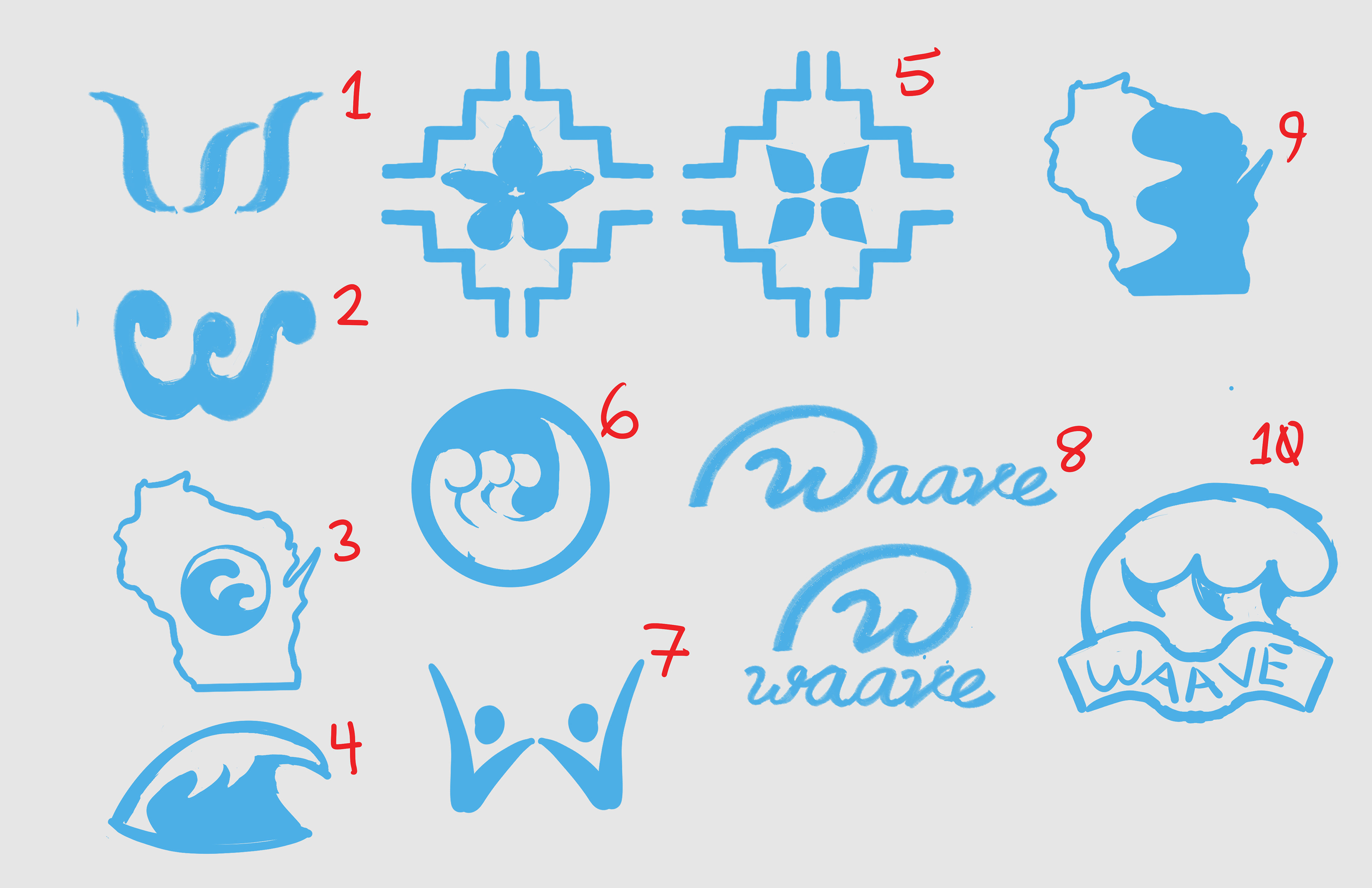
Pictoral/Abstract Mark Sketches
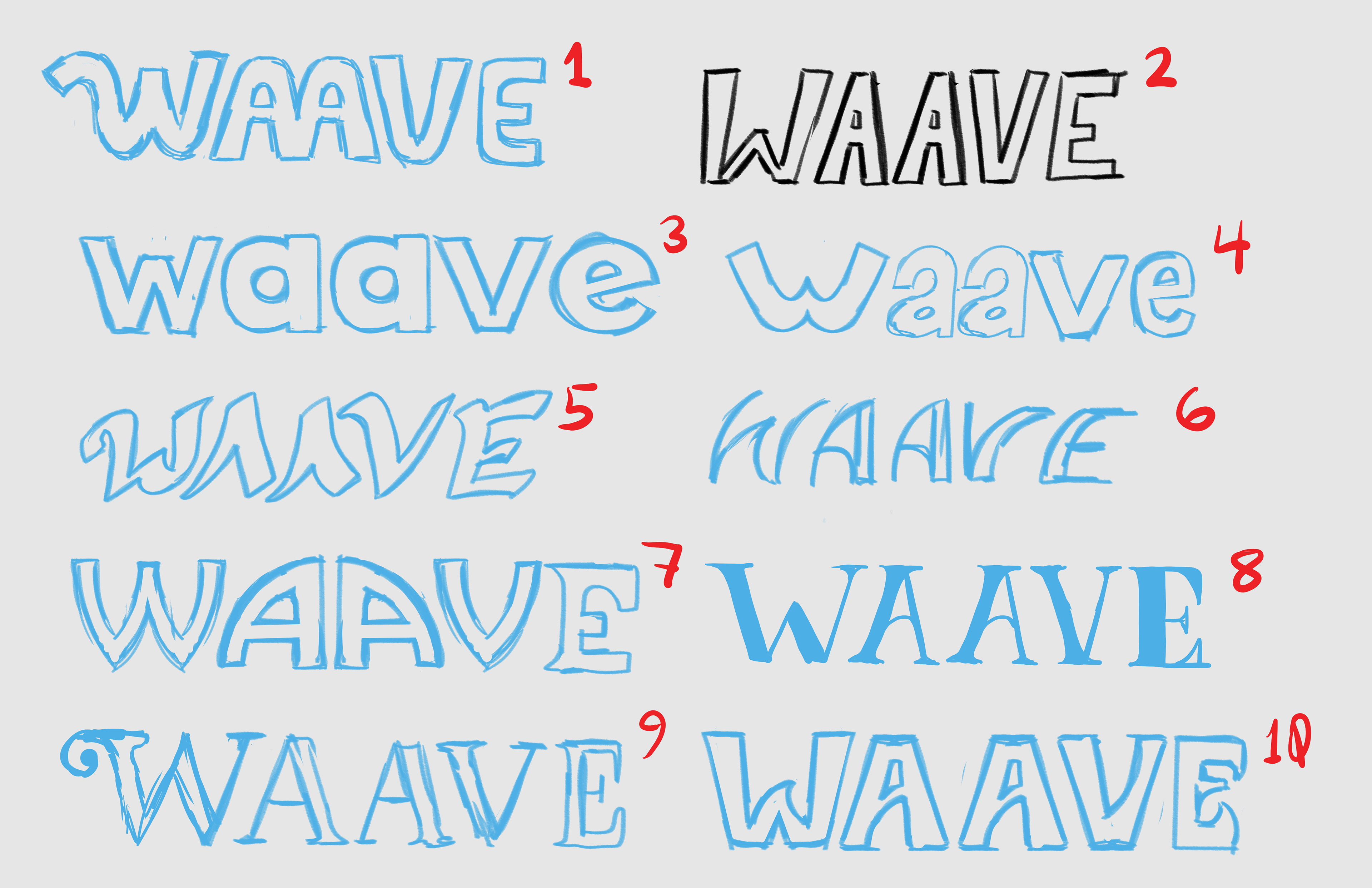
Word Mark Sketches
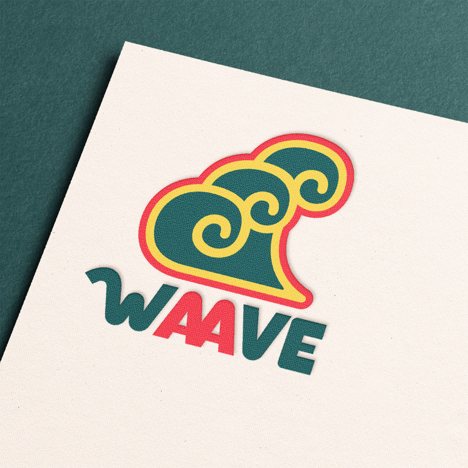
Refining the Identity
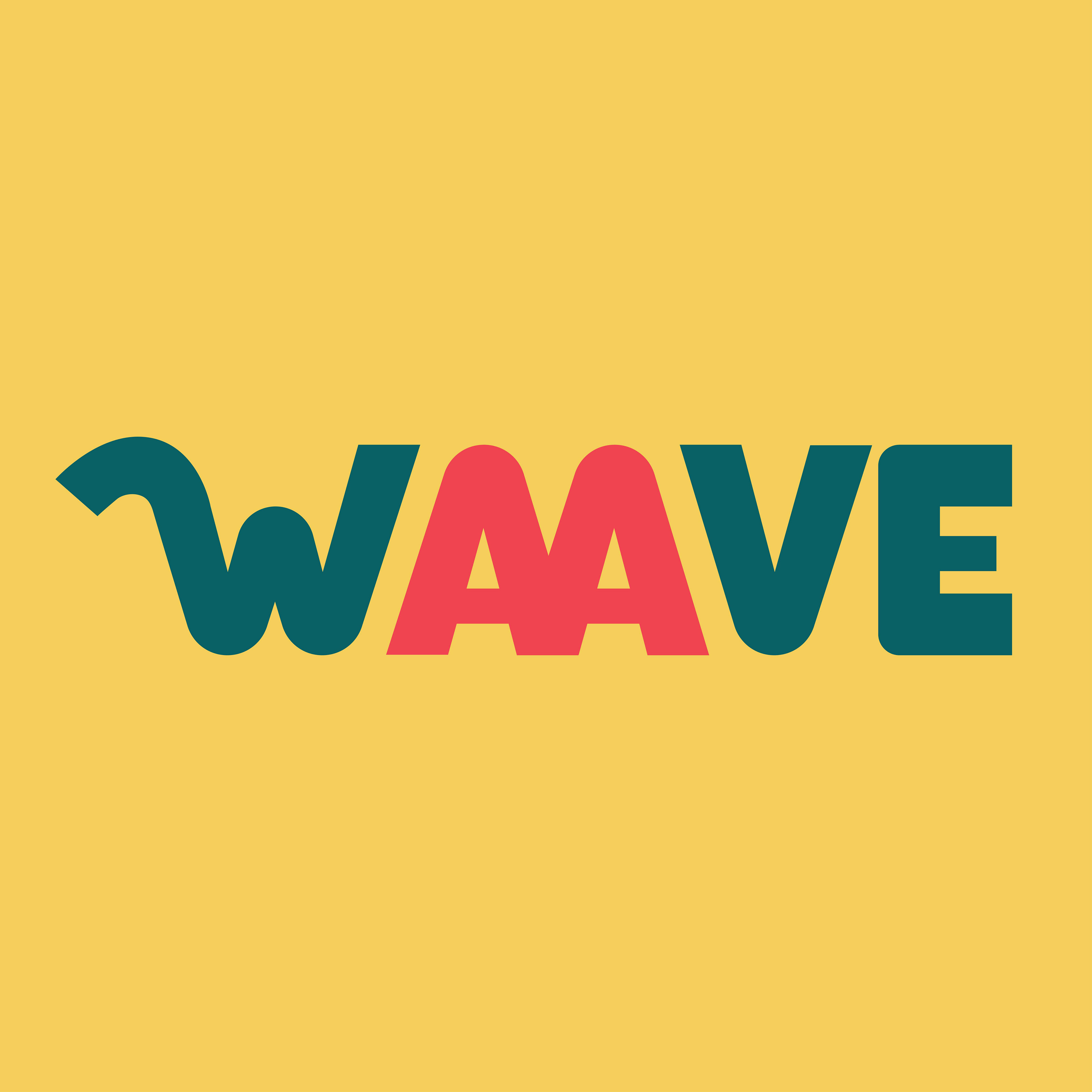
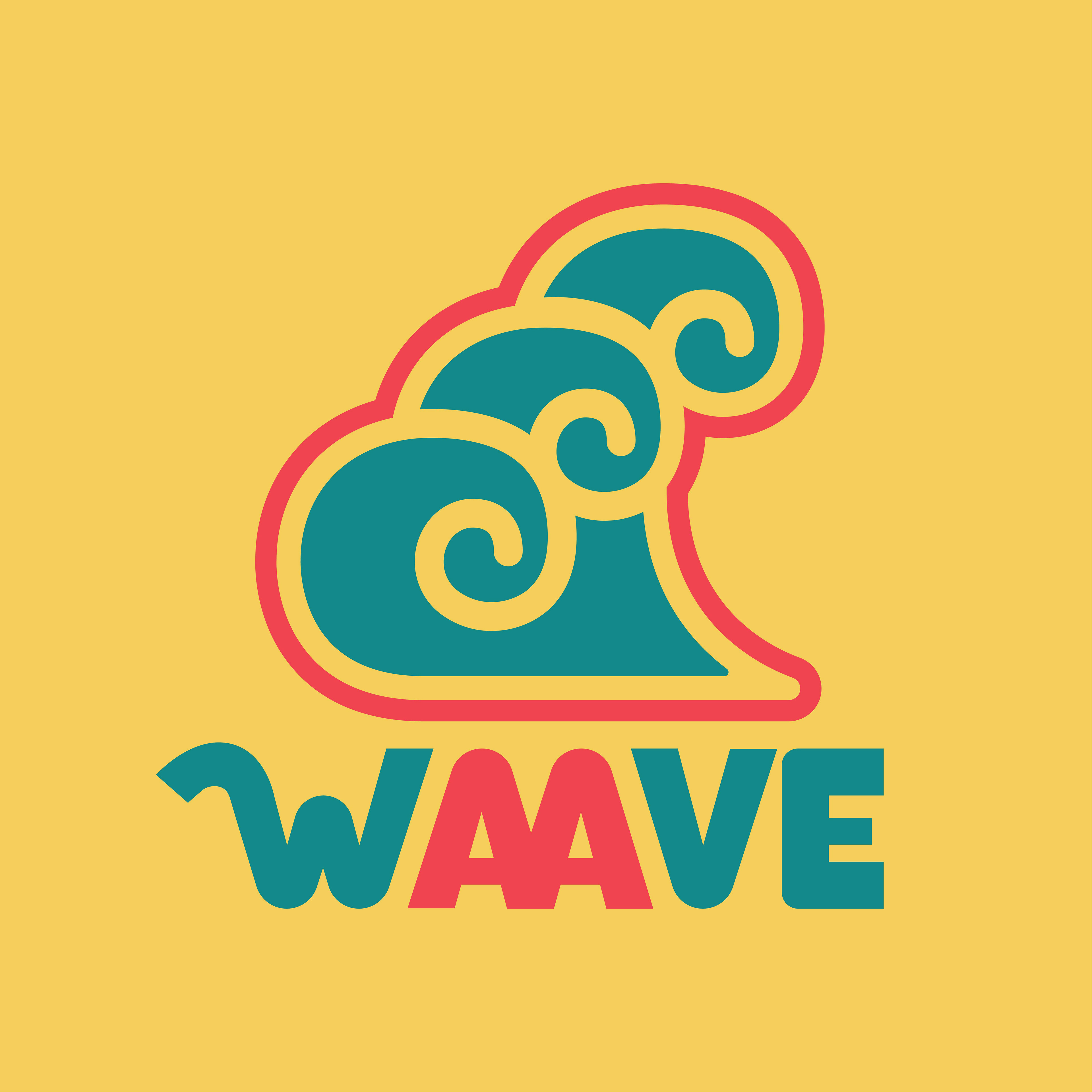
After selecting the most promising concept, I created several refined iterations that explored different ways of representing WAAVE’s mission through form and composition. The final direction was chosen for its ability to visually communicate collective strength, unity, and forward momentum.
The bold, interconnected forms symbolize individuals coming together to create meaningful change, while the upward movement reinforces the organization's commitment to advocacy and progress. The simplified geometry also ensures strong recognition and versatility across both digital and physical applications.
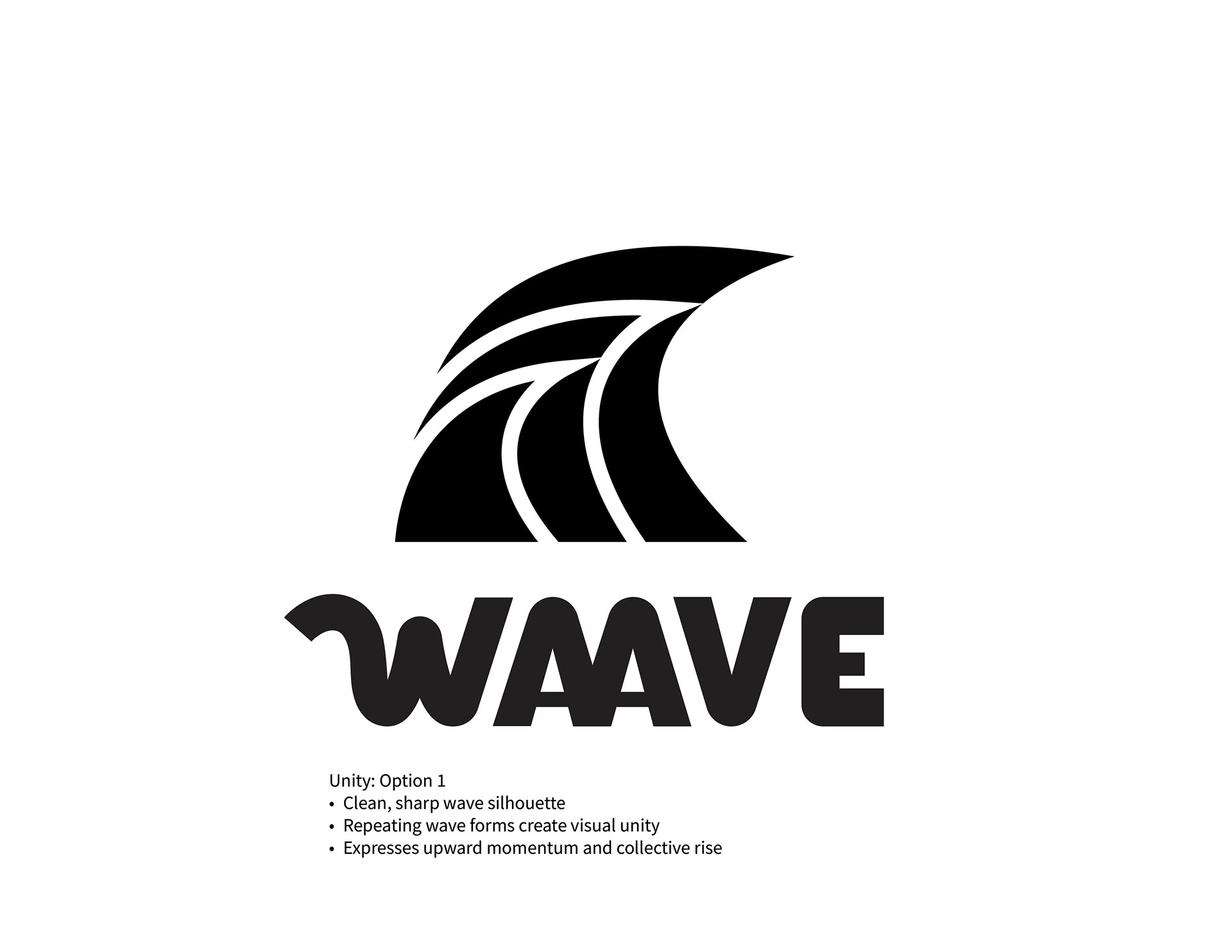
WAAVE Option 1
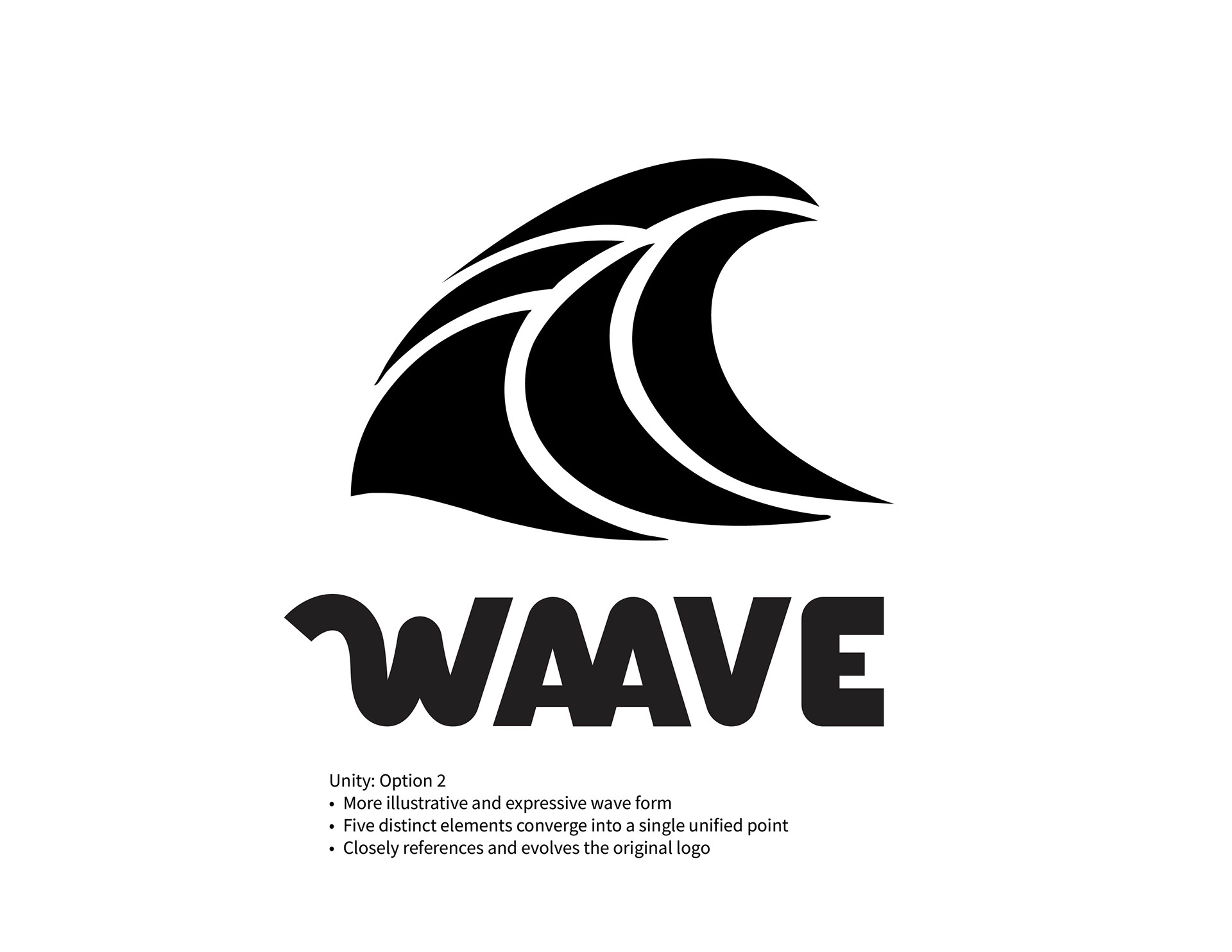
WAAVE Option 2
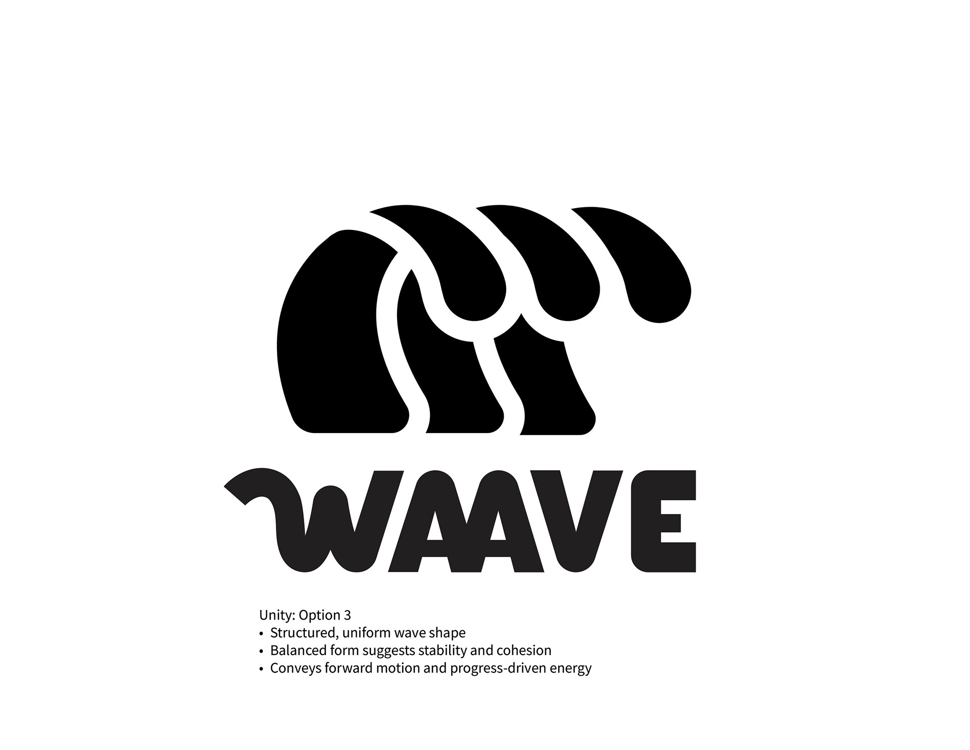
WAAVE Option 3
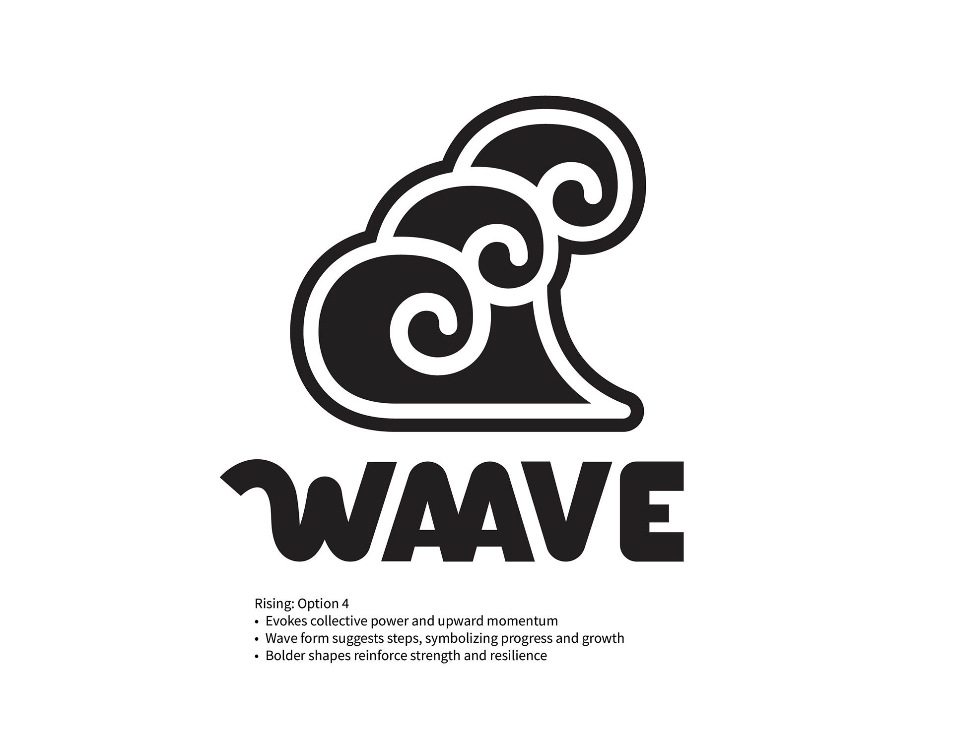
WAAVE Option 4
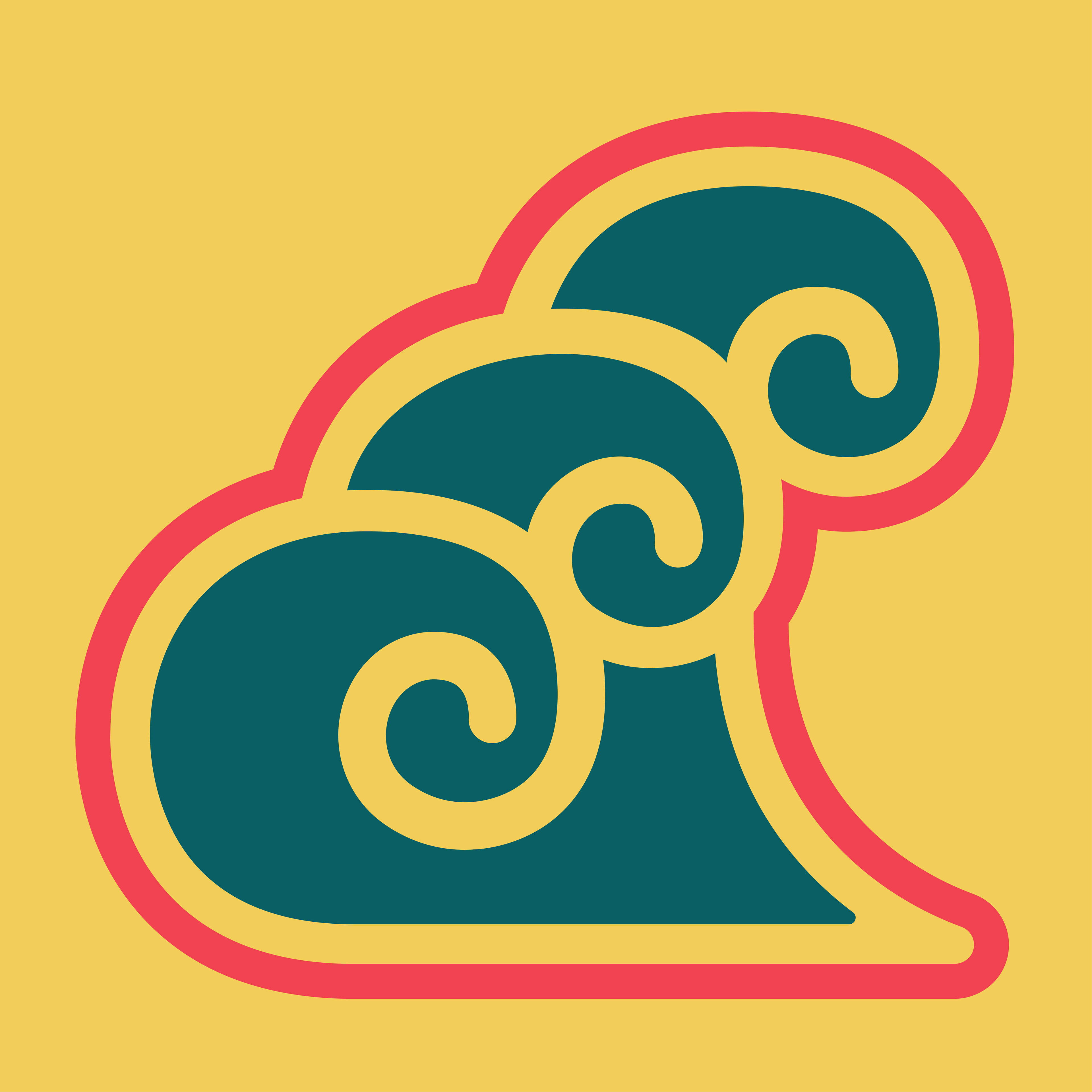
Color Development
Color exploration was conducted in close collaboration with the client. Multiple palettes were tested to determine the most effective balance of energy, accessibility, and cultural relevance.
The final palette draws inspiration from the vibrant colors found in traditional Korean pavilions, combining teal, red, and yellow to create a high-contrast identity. These colors convey optimism, inclusivity, and vitality while helping the brand stand out across outreach materials.
Intial Color Choice before Finalization
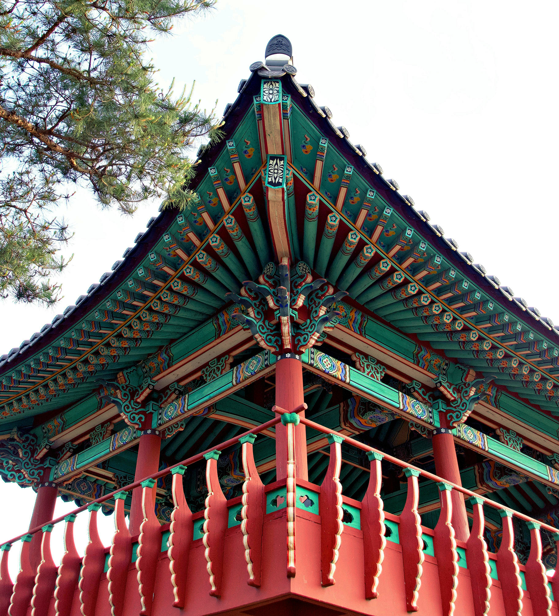
Korean Pavilion Inspiration (Source: Boo Normi)
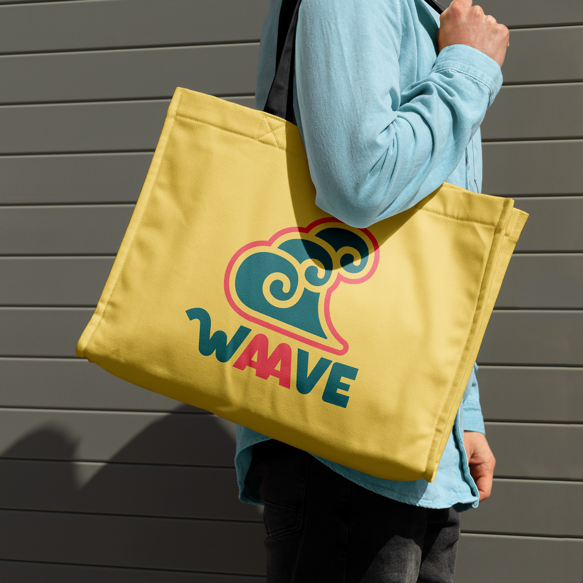
Brand Mockups
To demonstrate the flexibility of the identity system, a series of mockups were created across merchandise and promotional materials. These examples illustrate how the visual language can be consistently applied while reinforcing WAAVE’s mission of advocacy and community engagement.
The resulting identity presents WAAVE as an approachable organization that inspires collective action.
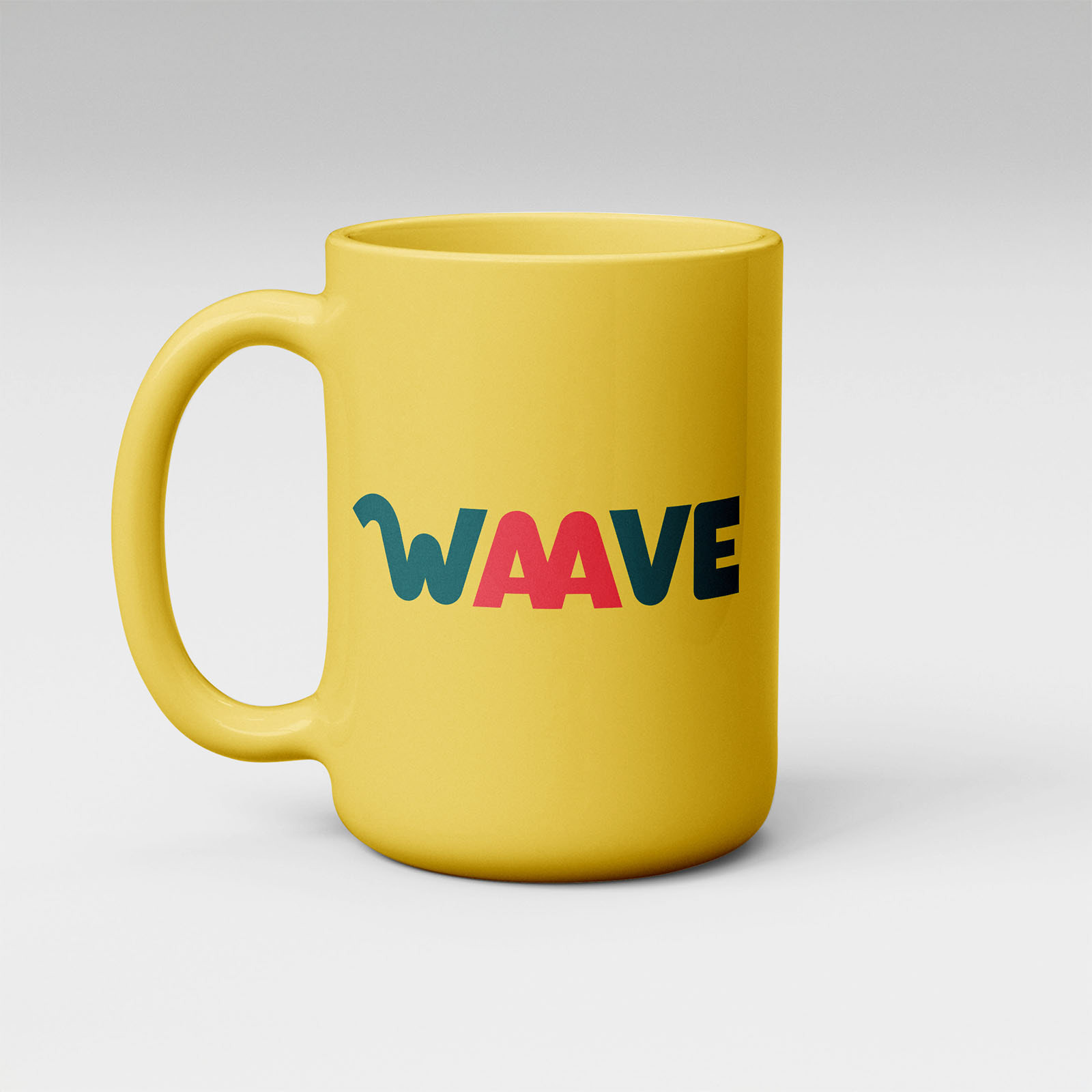
Mug Mockup
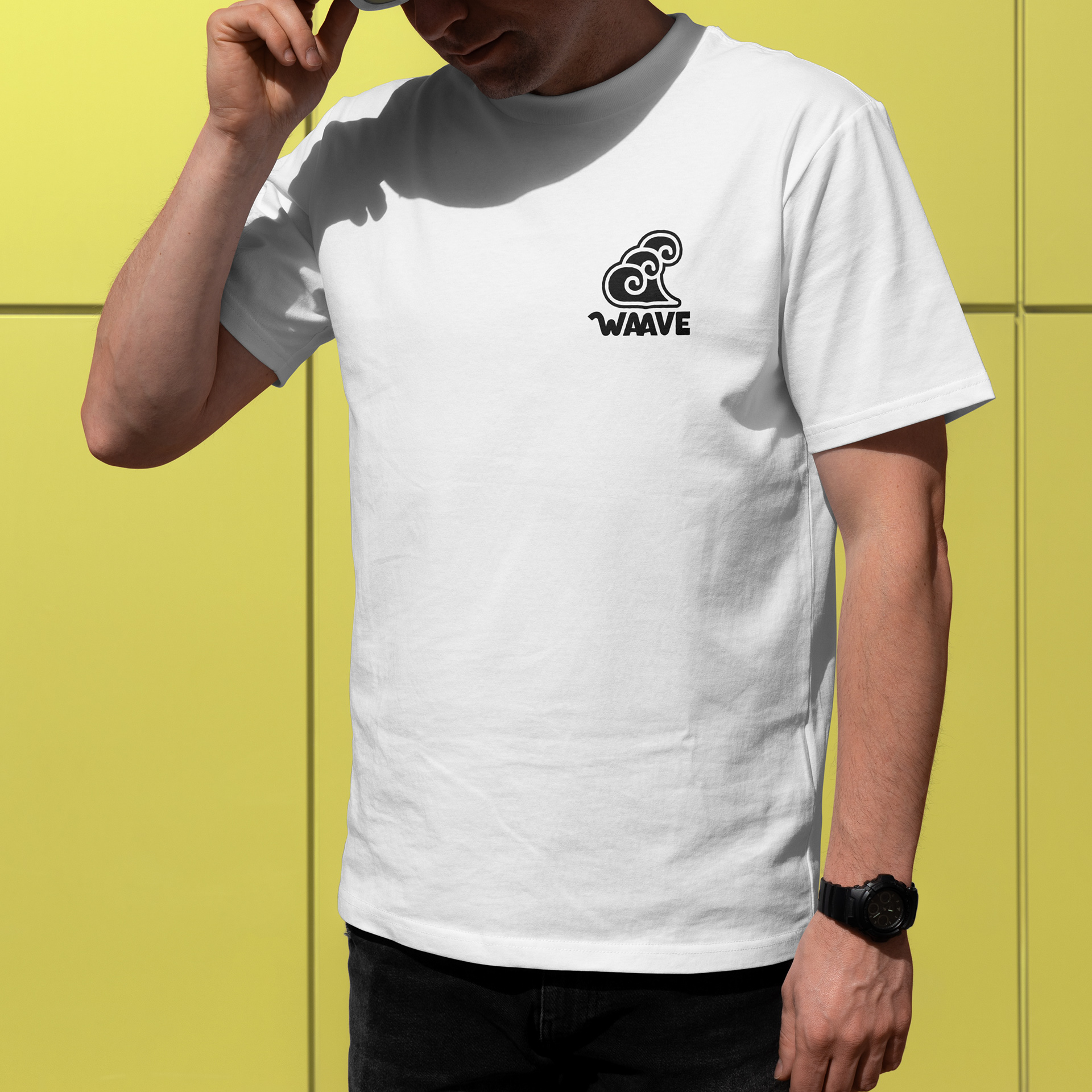
T-Shirt Mockup
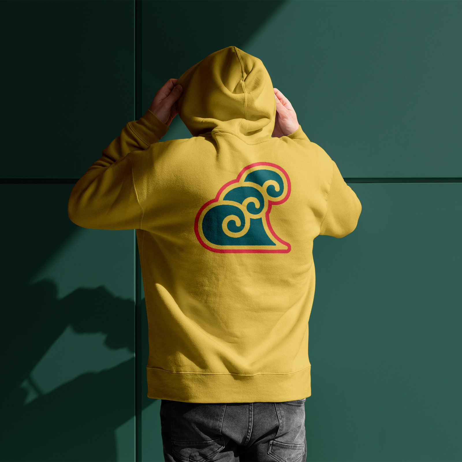
Hoodie Mockup